My assignment was to find ten pieces of text from incomplete typefaces, pick one, and finish the typeface.
I spent hours looking at French prints and came across a sheet music cover for 'L'Aveu de la faute" created by Henri Gabriel Ibels in 1893. (https://www.vangoghmuseum.nl/en/prints/collection/p1606V2000)
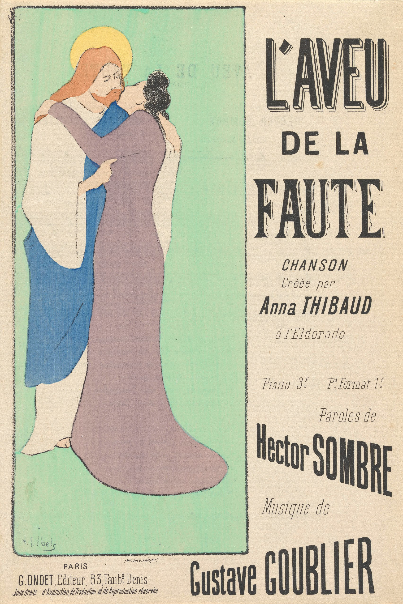
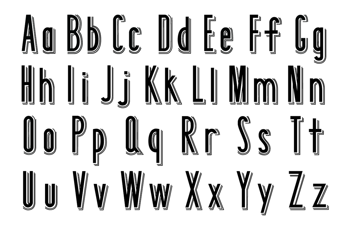
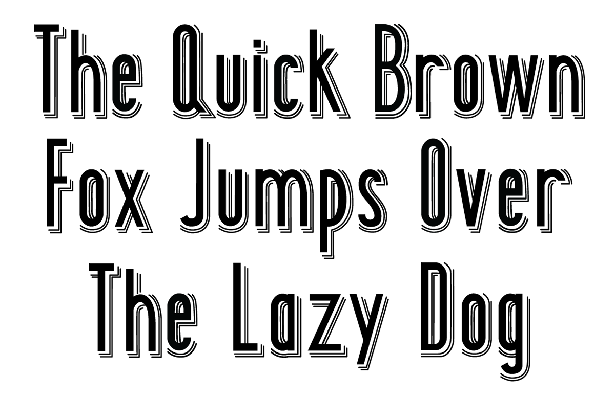
I focused on the top title because it seemed unique in that it was all-caps and had a left-facing box style with extra strokes to add more dimension. It had a trendy and graphic aesthetic.
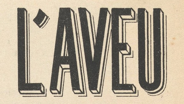
I initially traced the uppercase in Adobe Illustrator as it was originally drawn. After completing the case and gathering feedback, I decided to cut off all the angled connecting pieces. It led to more variation and a shadow illusion.
I created a lowercase based off of the line thickness and narrowness of the uppercase. Through my design process, I gained a better understanding of how to create depth in 2-D design, how pieces of text relate to one another, and the functionality of the pen tool.